Jewellery. Brand identity and online store concept.
We set ourselves a brief: a jewellery brand for the Kingdom, Arabic first, built around small pieces that are worn together and given as gifts. Then we designed all of it.
Open the storeThe idea
LAMSA means a touch. The name ends in the letter ة, which carries two dots. We set those two dots in gold, and the letter became the mark.
One mark, two scripts
The Arabic wordmark leads. The Latin wordmark and the single letter follow it, so the brand reads the same on a phone header, a box lid and a clasp tag.
Colour
- Sidr green#20362E
- Pearl#F6F2EA
- Sand#E7D9CC
- Champagne#B8935A
- Ink#171A18
Type
A soft serif for names and headlines in each script. The interface stays in a quiet sans.
Small pieces, worn together.
قطع صغيرة، تُلبس معاً.
Packaging
A rigid green box with the mark on the lid and a gold ribbon. The same green carries the store's header and buttons.
The store
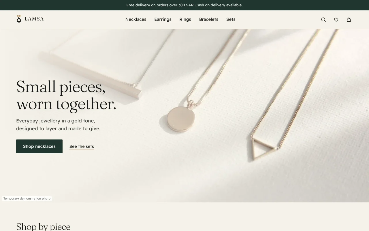
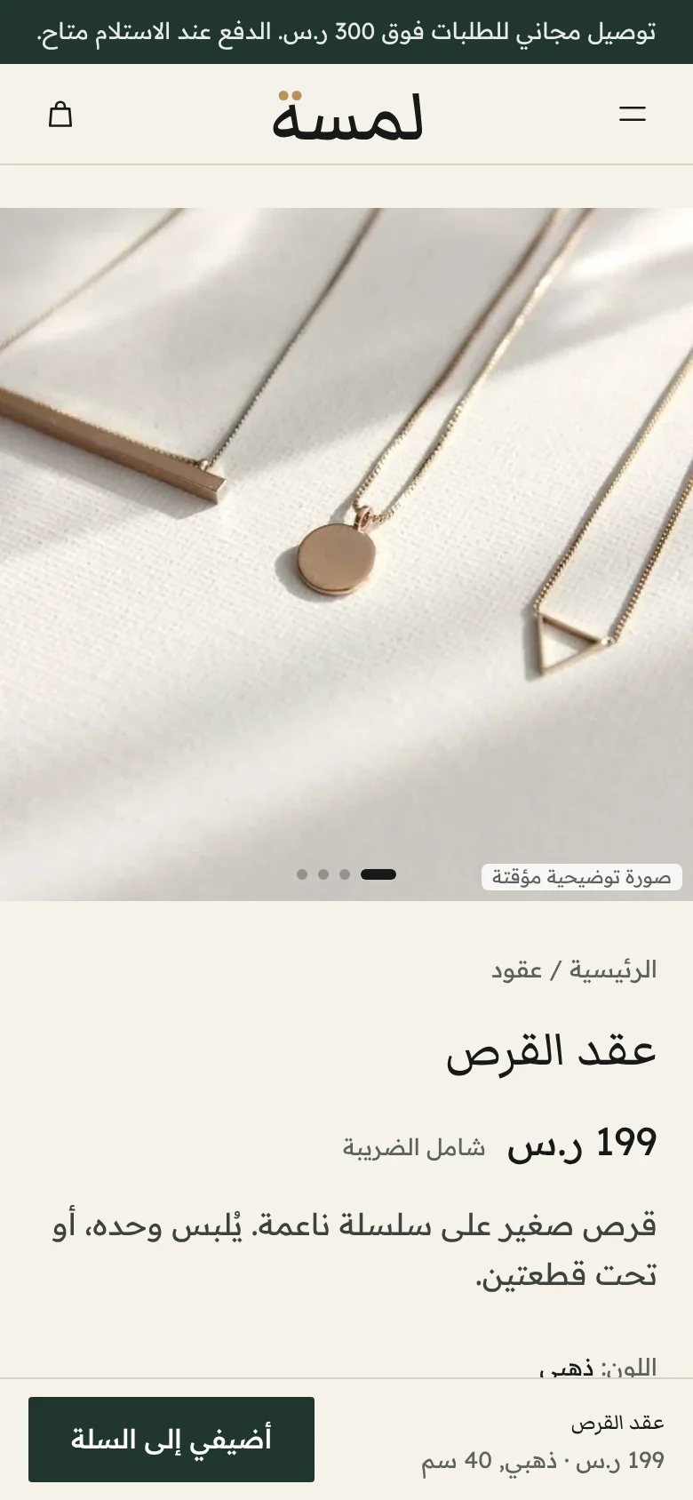
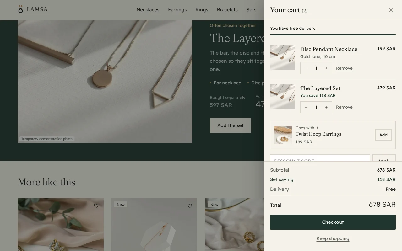
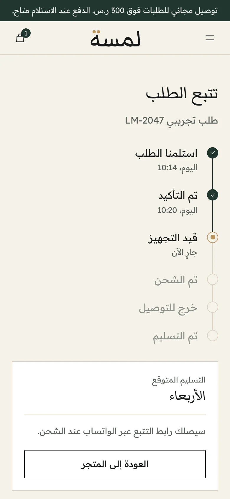
A complete shop that runs in the browser: home, categories, product pages with a gallery and size guide, a cart drawer with the set saving and a sample discount, checkout, confirmation and order tracking. Nothing is ordered or charged.
What is not final
- The photographs are temporary stock images, graded to one tone and labelled in the store. Original photography will replace them.
- The rose tone finish has no photographs yet.
- Product descriptions stay general. The store states no materials or care guarantees.
Tell us where your team loses time.
A few lines are enough. The discovery call and the written quote are free, and you commit to nothing until you approve the scope and the price.